Wednesday, February 14, 2018

Much Ado About Nothing: the Right's Response to the Obama Portrait

There are times when I think conservative media likes to invent controversy. Monday's orchestrated postings around 11:00 AM is one such instance.

The manufactured “outrage” at two of Kehinde Wiley’s models from 2012, posing as Judith, holding the severed heads of young white female stand-ins for Holofernes, is tiresome. But I guess it needs some deconstructing.

First—By the numbers:
  1. Per Wiley’s website, the two paintings in question are 2 of 35 paintings he produced in 2012. 
  2. They are the only 2 paintings on his website that feature disembodied heads. 
  3. There are over 200 paintings featured on his website.
  4. That is not his full output. 
  5. Meaning that w-a-y less than 1% of his painted output involves severed heads.

Second—Process:
  1. Wiley works with his models to choose a pose. 
  2. That typically means he gives them a bunch of books and they choose poses. 
  3. No young white women were actually beheaded during the production of the paintings.

Third—Meaning:
As my name probably betrays, I’m a white male, which has entitled me to certain privileges. For instance:
  1. When I am stopped by a police officer (which is seldom), I don’t fear I am going to get shot for no reason
  2. If I am shoveling my driveway, I don’t worry about getting harassed by the police
  3. If I’m locked out of my house and need to break in, it’s unlikely I’ll get arrested for doing so
  4. If I’m shopping in a store, and I happen to be wearing an item the the store typically sells, I don’t get charged a second time for the merchandise. I also don’t get followed around the store.

I could go on.

I also am not an ancestor of American slaves. No member of my family has been denied the right to vote, own property, or run a business based on their skin color. There is no record of anyone in my family being lynched, tortured, murdered, or raped because of their skin color.

Again, I could go on.

I also don’t go around not finding representations of me. if I am looking for a toy/doll for my kids, I have no difficulty finding a white toy/doll. If I am looking for children’s books, I don’t have difficulty finding white protagonists for my kids to read about. If I am looking for role-models for my children to look-up to, I don’t have difficulty finding white people in a-n-y profession to point to and declare, “see, some day you can be that too.”

I don’t know what the weight of any of that feels like, and I don’t carry that burden on my shoulders daily. But the two women that Wiley painted: they might. So if they want to be painted into a fictitious fantasy that symbolizes a turned tale of racial power, without it actually killing anyone, let them. It doesn’t make them racist. It doesn’t make Wiley racist for painting it. And it doesn’t make President Obama racist for choosing Wiley to paint his portrait—with or without an imagined sperm on his head.

It might open up a dialog about institutional racism, and the historic oppression of a populace. To some extent, that is what the book Judith is about.

By saying Wiley should not have painted those two paintings is saying that Wiley is not permitted to engage that discussion: no matter how indirect or inarticulate that attempt may be perceived.

And to say the 44th President cannot have Wiley paint his portrait because of those two paintings—the 44th President who was the daily recipient of racial epithets—is ridiculous. It’s also irrelevant. There was nothing he could do during his 8 years in office that would have pleased the racist critics, and the very act of having his portrait painted—even in the most staid of depictions—would be dissatisfactory to them.


By the very nature of the painting, and its stark break from tradition, there are many reasons people can dislike Wiley's unfamiliar approach to presidential portraiture, or President Obama's choice to use Wiley. I don't agree with the negative criticisms, but I understand those perspectives. Needing to invent some "hidden racist agenda" to dismiss the painting is weak tea, and for most of those parroting the criticism, probably a way to mask your own racism.

Tuesday, February 13, 2018

A New White House Curator: Missed the Peg

With the Obama-mania yesterday (at the National Portrait Gallery's unveiling of their portraits), I thought it best to make an tangential post that cannot be parked anywhere else except on this feral blog.

The White House has a new curator. Allegedly.

Last May, several news outlets reported the retiring of William Allman after a his many decades of service in the Office of the Curator. He had been appointed to the position of curator in 2002, and as the reporting indicated, had expressed intention to retire in 2016, but stayed on an extra year. There was no mention of his successor in any article that I could find. That struck me as curious. (Spoiler alert: it's probably not that curious.)

In the run-up to yesterday's unveiling, I started reviewing past articles about the Curator. In short, from Lorraine Waxman Pearce's appointment in 1961, through Rex Scouten's retirement in 1997, there is a solid record of who is curator, and when. When Pearce resigned, her successor (William Voss Elder III) is named in the same article. Lather-rinse-repeat through Clement Conger's departure and Scouten's ascension.

However, when it came to Scouten's retirement, articles covering his departure never mention a replacement. Only months later does Betty Monkman's name appear in an article with the title Curator. The same is true of Monkman's retirement in 2002: articles covering her retirement do not mention William Allman as her replacement.

So, here we are today: 9 months after the retirement of Allman, and the only mention of Lydia Tederick as White House Curator is a celebration announcement on Facebook, posted by the White House Historical Association on Oct. 27, 2017. 

Whether it's an issue of the White House not sending out P.R. about the last three Curator appointments, or it is newspapers not caring to publish them, I don't know. Perhaps those news articles didn't get scanned into ProQuest's archives.

Regardless, any legitimate peg for such an announcement has long passed. Still, it's nice to have a record of the appointment: somewhere: other than Facebook: or my blog, for that matter. 


Tuesday, January 23, 2018

My Letter to the SF Chronicle

Last week I sent the below letter to the editors of the SF Chronicle, and their art critic Charles Desmarias, in response to an editorial by Michael O'Hare, who proposed museums sell off the bottom 1% (in value) of their collection to fund free admissions.

Yesterday, Desmarias was kind enough to include a reference to my letter toward the end of his OpEd responding to O'Hare. However, since my full letter didn't make it into print (that I know of), it is below. 
===================================

I’m all for a good “let’s sell off the artwork to save the art museum” argument as the next guy. Unfortunately they are never good arguments. Michael O’Hare’s editorial from Jan. 12 is no exception.

His old essay supporting deaccession, repackaged for your paper, infuses recent deaccession news at the Berkshire Museum and admission increases at the Metropolitan Museum to support an argument that art museum attendance would improve if art museums were free. (The Met, I should note, had record attendance years in 2015, 2016 and 2017, when admission was still "suggested.")

Attendance doesn’t exist in the vacuum of admission costs, of course. His argument ignores the numerous plausible causes that have disenfranchised an arts audience over the last 50 years: Cuts in art criticism in collapsing pulp media outlets;  Arts curricula cut or eliminated from K-12 education; Cuts to the NEA; President Obama's disparaging joke about art history majors.

Clearly O'Hare has glommed onto the outrage of The Met's aim to charge out-of-towners $25 to visit the museum, which holds millenia of masterworks that only exist in one location. That does seem like a steep price. Never mind people pay $18 to watch predictable 2-hour long super-hero movies in New York (which are available in theaters everywhere, and on-demand next month).

So, let’s drill down into O’Hare’s bar-napkin economics argument on how to raid museum basements to increase their attendance, why it doesn't work, and to where he contradicts his own argument.

O’Hare’s revisited premise of selling 1% of the value of a museum’s collection currently leans on a thought experiment that The Met sell off 9 works to endow free admission forever: 9 works by the likes of Picasso, Gauguin, and Rembrandt. The free admission will increase attendance, he claims, citing how attendance rates soared in the UK when they made their museums free. UK museums are supported by the government, not by fire sales from the collection. Conversely, two Baltimore Museums (which are not government funded, nor purging artworks) experienced a drop in attendance after they eliminated admission fees. Baltimore is not mentioned in O’Hare’s editorial.

The 1% figure is pulled from the $35 billion assessed value of the collection at the Art Institute of Chicago (AIC). 1% = $350 million. O'Hare suggests selling all the bottom 1% of the collection, "which no one ever sees," to nearby institutions that would want them: Museums, O’Hare presumes, that would be eager to have them! Museums, that we can assume, like Baltimore, are also experiencing attendance issues (and, let’s speculate larger attendance issues, since they lack Chicago’s density and tourism appeal).

What treasures lurk in the bottom-valued 1% of the AIC collection? ¯\_(ツ)_/¯ Maybe purchase prizes from area exhibitions in the 1930s and 40s? Some Roman coins with eroded reliefs? A calotype left in the sun too long? It's not to say any of those are booby prizes. But their greater value likely resides in how they support the collection as objects of curatorial and conservation research, or how they reflect the history of Chicago and the Art Institute more specifically. Exhibited anywhere else: those works might seem out of place.

Alas, this 1% recipe, O’Hare admits, might not work everywhere. It might not work for San Francisco museums, he suggests. San Francisco: a relatively big city, in an area of dense population, where tourists tend to go. If it won’t work for San Francisco, then it certainly won’t work for scores of museums in smaller markets like Oklahoma City, Milwaukee, Omaha, Davenport, or Toledo.

What could work for The Met, or the AIC, won't work many other places. And since The Met isn't having an attendance issue, it's an unnecessary argument to begin with. O’Hare’s bar-napkin economics exercise must have been after a few too many.

Monday, July 25, 2016

New to You, 2015: Pantheon

The game, Pantheon, was created for an exhibition at The Strathmore, Bethesda, MD (where, I was an artist mentor a second year).

Play is similar to Sorry! where players draw cards to advance their pawns. Pawns consist of 3D-printed replicas of sculpture by Rodin, Houdon, French, Duchamp, and Judd. Players advance from emerging artist through mid-career, and on to the Pantheon. Only, the cards might not allow it. Having an exhibition might advance the pawn, but a studio fire might send the pawn back a couple spaces. There are also death cards, sending any player who is not established back to the beginning.

In short, it's nearly impossible to make it into the Pantheon: just like life.


Friday, November 29, 2013

My Work on CW's Carrie Diaries, Last Week

You really couldn't ask for better placement: upper right of the title.

In September I was asked if Warner Bros. Pictures could purchase a work for the set of The Carrie Diaries. As you see above, I said yes. Back then I was told it would be for a show on the CW called The Carrie Diaries, a prequel for Sex and the City. Ever since I became one of those "pretentious people" (#15) who only seldom watches TV shows, and when he does it's on the Internet, I'm a bit oblivious to... well... what's on television. (Seriously, why pay for cable when you don't really have time to watch any of it? Actually, why pay for that digital converter thingy when the appliance you call a television I call "the DVD-viewer" works quite well without it?)

Still, I lived a childhood existence much like Martin Tupper from Dream On. So, needless to say, I was excited to be asked.

It turns out, this was the second time this particular work was requested for exhibit on television. The first time was for a show called Georgetown, which was supposed to air on ABC in late 2011 or early 2012. Unfortunately, the show got canned before the pilot aired. As such, the painting of Homonyms never saw its transfer to moving image.

And, technically, it still hasn't. What was on display behind Adam Weaver—the character to whom Carrie Bradshaw eventually loses her virginity in the episode (unfortunately not in front of my work)—was a digital print of the painting. The original, which first exhibited in Alexandria, VA's Athenaeum in 2008, was composed of 64 separate, eight-inch canvases: hence the lines on the image above (the CW was given an option for without lines).

The full episode can be viewed on line. We'll see if the work pops up in future episodes. And, if you want to own the work, contact the gallery that represents me in DC.


Sunday, November 24, 2013


Last weekend my latest exhibit opened up at Adah Rose Gallery in Kensington, MD. If nothing else, the exhibit represents how awesome and supportive Adah Rose is about her artists, because the exhibit represents a clear departure from one of the two directions I take with my work.

Yeah… two directions: implying a third. The first is a more conceptual socio-political commentary—a vein of production I'll attribute to time I worked with Randall Packer and the U.S. Department of Art and Technology. While Randall had no direct influence over pieces like Note 2 Self, JOB Creation Project, or Acting Presidential—and to some extent the DIY Conceptual Artist—working with him gave me the permission I needed to explore veins of operation outside of painting: interactive works that were somewhat performance-based, and using everyday objects or familiar design methodologies to fool the mind into receiving and then question the work: trompe l'esprit. The second direction was text-based. And though some of my socio-political projects rely heavily on text (bumper stickers, campaign posters, books, printed newspapers), these works were simply text… or the absence thereof. The work of mine that Adah Rose typically exhibits are four letter words, alphabets, and erased newspapers.

The alphabets have been highly successful. Several prints have come close to selling out, and there is demand to add to the series. And though few want to own an erased newspaper, or a single from a suite of four-letter-words, each series creates conversation. So, I think it is pretty awesome that Adah Rose was willing to take this brand that I have developed within her gallery, put it aside for the time being, and let me explore a different body of work. Though, the work was not entirely alien to her.

When we first met in 2011—about five months prior to my first exhibit in her gallery in Feb. 2012—I showed her a series of shaped paintings I was thinking my way through, and mentioned this other body of work. It was a series inspired by a staircase in Hurst Hall at American University.

In 2006/07 I was working for the Center for Teaching Excellence at AU, and my job was to oversee the Faculty Corner, a lunge where faculty could checkout laptops, podcast equipment, edit videos, and seek some help with Blackboard. It was located in Hurst Hall, a building that only had bathrooms in the basement, and I worked on the second floor. So, I was regularly going up and down the stairs during the time of my employ. And, the stairwell did something to my perception. Inspired, I photographed the stairwell up and down. Eventually, I started composing from the photographs with the thought that these could become shaped-canvas paintings. And, then, I discovered the work Frank Stella accomplished after his protractor series. About 100 photographs and over 50 drawings were immediately shelved.


When I shelved the series it was less than two years after I finished graduate school, and one of the ghosts of grad school was the fear of making derivative work. Anytime I thought I was advancing in my work, I would later discover that I was bumping into Jim Rosenquist or Robert Rauschenberg or someone else. And I was typically ignorant of the works of those artists (as I was of most work of artists after 1940) throughout graduate school. There were several critiques where i was lambasted for making works that looked like this, that, or the other—or why wasn't I using some medium other than oil paint— and I eventually threw up my arms and threw out my paint brushes (both figuratively, of course).

After shelving the project I would start reading more about Elizabeth Murray, and Al Held. Pile up enough influences (after the fact) and at some point it seems credible to ignore the superstitions of graduate school. While it is essential to be knowledgeable of the works of other artists, it's also pertinent to—at some point—acknowledge that it's okay to move forward. I probably came to that conclusion a couple of years before 2012, when I began to give consideration to starting the works.

The Hurst Series, or the Staircase Series—a series of untitled paintings, some of which have received kitchy nicknames after the fact—does what it set out to do: upset the conventions of looking. By no means can I claim that these works are ground-breaking. Shaped canvases go back to the Renaissance, if not further back in history. Works that deal with spatial imperfections probably precede Escher. It is doubtful that the confluence of both is anything new. Regardless, there is still something magical about a work that can visually pop off the wall thanks to the shift in paint values or because of how it is shaped (or both). This happens to me when I see some of Ellsworth Kelly's work (from the right angle): simplicity jumps off the wall and tickles my mind. It's what I love about the works of Robert Irwin and James Turrell. Elisabeth Murray doesn't do that for me. Stella's work never did it for me either. Al Held's does, but he was mostly beholden to the rectangle. And, the work of Lee Bontecou does the inverse of what I'm trying to accomplish with these shaped paintings.

If anyone is doing this kind of work, I don't know it. That's not to say it isn't happening. There are probably 100 graduate students across the U.S. doing something similar, as well as another 100 in a few art programs I am unaware of, at universities I have never heard of, in some huge city in China that I have also never heard of. Quite frankly, I could care less. Because, the series represents one of the first times I have used art to make a problem and then solve for it, rather than using art to try to solve a problem, comment on problem, or comment on a problem in an effort to make more problems (for the recipient, not for the art). It feels authentic: which is not to say past works have felt inauthentic. There are times that past projects and works have felt gimmicky (art masquerading as bumper sticker… or perhaps the other way around), but the gimmicky was more-or-less embraced as another medium of the work (Art can be cheesy). Perhaps that authenticity comes from the fact I was pushing some paint around. Art always feels better when its possible I might get dirty or injured in the process of making.

The show runs through December 28, 2013, at Adah Rose Gallery in Kensington, MD.

Thursday, March 28, 2013

Images from the DIY Conceptual Artist


On March 16th,  my latest art project, the DIY Conceptual Artist, opened at DorisMae. Formerly Harmon Art Lab, the space is dedicated to a curatorial project run by Thomas Drymon... and he hesitates to call it a gallery.

The scope of the project is a game. As pictured above, it has a rule book, some art materials, and it comes in a box. Players can choose whether to execute one of several projects, and the projects are based on works by several archetypes of conceptual and contemporary art of the 20th Century. 

Exhibiting one room over is Rachel England, who is showing the work she made for her senior thesis at the Corcoran, only with a twist. Instead of it being some inert installation, visitors are invited to destroy the work, pulling the crocheted scarves apart - skein-by-skein.

Creation in one room. Destruction in the other. All work is participatory. 


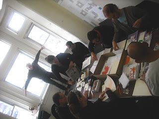
On March 24th, the space was open for an artist talk. Only, we didn't talk. We just directed people through the act of participating with our projects. Pictured above are people diligently working on their pieces. More images on DoisMae's website.

This idea has had an odd life. Initially it was proposed to Transformer near the end of 2010. In a reply to the submission I was told that review of proposals sometimes takes a while. I guess the proposal is still under review. Then in late 2011, the curator from VisArts Rockville approached me about a 2012 exhibit. I introduced the idea, he liked it, the exhibit was scheduled, contracts were getting signed, and then someone higher up the food chain explained they no longer agreed with the curator's vision, released him from his contract, and along with it all of his exhibits (I guess he wasn't showing enough community plein air hobbyists, or something).

As with many of my projects, there are a bundle of ideas converging.

  1. After nearly a decade of teaching, I've had a lot of students resist contemporary art, and with it conceptual art. I wondered if there was a way to make the ideas and processes more accessible.
  2. Then there is the idea of traditions: old masters had apprentices, and sometimes the pieces of mature apprentices look nearly indistinguishable from the old master. At the very least you can see the relationship. Think early Raphael as compared to Perugino. 500 years ago, the practice of teh student looking similar to the master was more desirable. Now it is derivative. Anyone who drips paint on a canvas clearly echoes Pollock, and that's a bad thing, I guess, unless it's a slipcover for the couch. 
  3. Additionally, I think Art should be affordable, everyone should make art (so, I don't really poo-poo the plein air painter), and everyone should have "original" art to display in their homes and offices (i.e. something made by had, not by machine).  Clearly I don't think this should be everyone's living. I think it should be something they know how to do. That they shouldn't be limited to avenues of representation. That they should be open to a broad range of ideas, disciplines, and work. (I fully accept not all art made from my project will be good.) 
  4. Of course there are some notions of subverting the function of the gallery space: Of making the gallery space interactive and collaborative: Of changing convention and expectations. Working with Mark Cameron Boyd opened me up to some of these ideas. And I can't ignore how popular the ideas has become to others, for example Reuben Breslars' Sketch (ironically, at Transformer), and Eames Armstrong's Smutty Valentine, artists leading artists in community art-making activities is nothing new. However, I (and I assume they also) don't want this to be limited to just artists. 
  5. Finally, I've been wanting to write a book. I've been wanting to make a game. This project is a convergence of those two whims.

The game is selling for $30 ea. Half of all sales will go to the Tulk Family Education and Assistance Fund.